Work / Branding · Web · Packaging
We transformed Ditek Consulting into a stronger healthcare brand.
About Ditek Consulting.
A medical kit brand built around delivering reliable, organized, and purpose-driven solutions for healthcare organizations.
- Medical
- & healthcare
- Kit solutions & services
- 360°
- brand system
- Designed & delivered
- Reliable
- supply & logistics
- Supporting better healthcare delivery
- Innovative
- & customer-focused
- Solutions that simplify healthcare
Professional identity
A clear and recognizable visual identity designed to establish Ditek as a credible and trusted medical brand.
Complete brand system
A consistent visual language carried across the logo, packaging, and digital experience for a cohesive brand presence.
Connected experiences
A unified brand presence connecting physical products and digital touchpoints into one seamless experience.
The problem
The challenge.
- Create a professional identity for a modern medical kit brand
- Develop a recognizable logo that communicates trust & reliability
- Build a website that clearly presents brand & its solutions
- Maintain a unified visual language across physical & touchpoints
- Create a stronger and more established overall brand presence
- Design packaging that creates consistency across different medical kits
Our part
What Zohlink did.
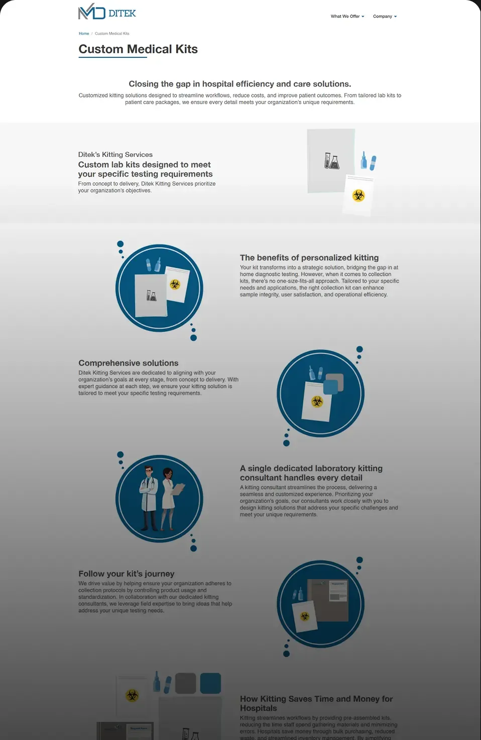
We developed Ditek's visual and digital presence through its logo, product packaging, and website, creating a cohesive brand experience across physical and digital touchpoints.
- Logo design & brand refinement
- Website design & development
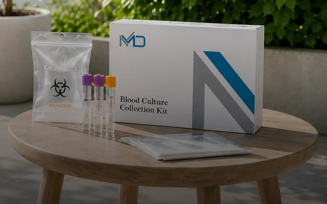
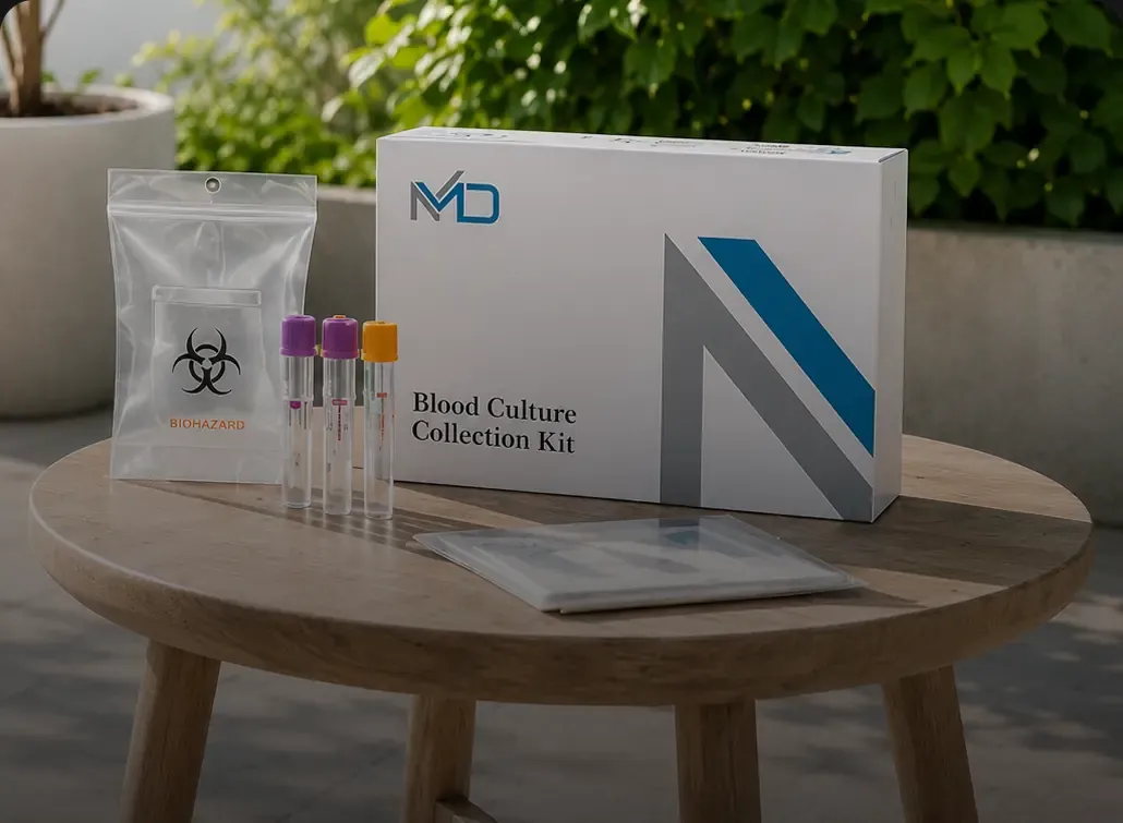
- Packaging design
In scope
Project scope.
- Logo design
- Website design
- UI/UX design
- Visual identity
- Packaging design
How it ran
The process.
- 01
Research
Studied Ditek's industry, audience, and positioning to understand the visual requirements of a modern medical brand.
- 02
Brand concept
Explored visual directions focused on trust, precision, reliability, and professionalism to establish the foundation of the identity.
- 03
Logo design
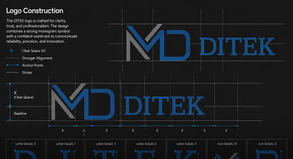
Developed the selected concept into a complete logo system, refining the symbol, typography, and overall composition.
- 04
Packaging
Translated identity onto medical kit packaging, creating a consistent visual approach that could work across different products & formats.
- 05
Website
Carried the established visual language into the website, creating a digital experience that connects the brand with its solutions.
- 06
Refinement
Refined the visual system across all touchpoints to ensure the logo, packaging, and website worked together as one cohesive brand.
The work
Project gallery.
The result
The outcome.
Ditek received a complete and cohesive brand experience, connecting its identity, product packaging, and website through one consistent visual direction.
- Distinctive medical brand identity
- Consistent packaging system
- Professional digital presence
- Unified visual language
- Stronger brand recognition
- Physical & digital experience
Impact
- Connected
- brand system
- A unified visual language carried across the logo, product packaging, & website.
- Professional
- brand presence
- A polished & structured presentation that gives Ditek a stronger appearance.
- Connected
- physical & digital
- A cohesive experience to connect the brand's physical products.